Producing the Thoth Tarot
A Talk at Catland Books in Brooklyn, September 23, 2017
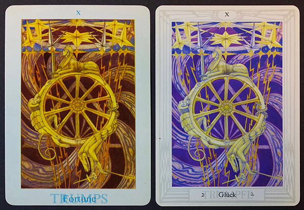
(Image on left is a sample of the 1971 printing. Image on the right is from the 1977 photography in a German language deck)
I was originally introduced to the Tarot in 1967. I used Waite’s book and his deck. I followed his layout suggestions and was spooked by not only how accurate my first reading for myself was, but also by the fact that the Tarot pulled no punches in describing certain personal characteristics that I did not find pleasant.
The Tarot became extremely important to me when I read Paul Foster Case’s superb book Tarot: A Key to the Wisdom of the Ages. He uses the cards as an introduction to Qabalah and the Tree of Life—which link all known themes of the metaphysical world such as astrology, mythology, magick, and alchemy.
In 1969, Weiser’s published The Book of Thoth, Crowley’s magnum opus on the Tarot. This was a well-executed second edition, a reprint of the 1944 original. Crowley’s own publication was an exquisitely printed, limited, numbered, and signed edition of 200 copies that has been a treasured collector’s edition since. Its eight color plates of several cards were hand-pasted in.
O.T.O. Caliph Grady McMurtry helped Crowley finance the printing of that first edition and was given a part ownership of the rights in return.
I bought my hardcover copy of the 1969 Weiser second edition the day it was placed on sale at the bookstore at 734 Broadway. I lived at the time about 100 miles away in New Jersey. I awoke from a dream in which I was told Crowley’s Tarot book was at the store. I drove up, walked in, asked about it, and was met with a smile by the clerk.
That copy traveled back and forth across the country with me for years in my 1956 International Harvester van — fitted with bed, stove, 8-track tape player, and bookcase. When I landed for my three decades in New York City, it seemed I changed apartments as often as some do their socks! And each time, I packed my copy as carefully as I could. But it endured a lot of wear and tear from both moving and reading. It’s so good to have this new 60th Anniversary Weiser Books hardcover! More on that in a bit.
In 1971, the first printing of the Thoth Tarot cards was published. It was much welcomed by all Tarot devotees and Crowley aficionados, but it was a muddy-looking deck of disappointing print quality.
The paintings at the Warburg Institute in London were photographed for that 1971 printing as 35 mm slides by Llee Heflin of Level Press. He worked with Grady McMurtry who arranged for Heflin to gain access to the paintings. Weiser and Llewelyn published the decks, and were soon joined by playing card specialists US Games.
I began working at Weiser Bookstore in 1973 and moved into the publishing department about 6 months later.
Donald Weiser and I became close. I eventually discussed with him how inferior the cards of the deck were when compared to the quality of the beautiful images in The Book of Thoth itself. I knew the deck could be improved.
It had sold so well that I was able to persuade him to give me permission to discuss making new photographs of the paintings at the Warburg Institute. I entered into correspondence with Gerald Yorke who controlled Frieda Lady Harris’ portion of rights to the Tarot paintings. He referred me to the Director of the Warburg, at the time Dr. J. B. Trapp. Yorke had donated the paintings to the Warburg for safekeeping.
Donald then introduced me to Stephen Skinner, a friend of his, a fellow occultist, writer, and small publisher. Together Stephen and I worked to hire a local British photographer to shoot the cards in 4 x 5 format.
Our photos were thus about 400% larger than Llee Heflin’s 35mm photos. They were almost the same size as the cards we printed. In color printing, the key is to make photos at least as close to the size of the printed product as possible. Photos can certainly be larger and then reduced, but never successfully enlarged without some degradation of image quality. Thus, the second edition of the Thoth Tarot in 1977 was actually the first professionally produced publication of the cards.
I spent about two years in the process of negotiation and production of the new decks. As the project was entering its final stage, I left Weiser in the late spring of 1977 to start Studio 31. Everything was set and going well. I was confident the decks would be fine. I remained in close contact with Donald and Stuart Kaplan of US Games who were co-publishing the new deck.
They commissioned me to write the booklet to accompany the cards. I can’t imagine how many are in print at this day, but I received $250 for my work. I wrote a brief introduction about Tarot, Crowley, and Lady Harris, and carefully compiled the divinatory meanings of the cards from The Book of Thoth and the Golden Dawn materials. I got Robert Wang’s permission to adapt a 15-card layout he had given in his book, An Introduction to the Golden Dawn Tarot, which he had naturally adapted from someone else. I modified it slightly based on my experience. Bill Breeze helped by giving me a catalog of an exhibit of Lady Harris’ paintings written by Robert Cecil. He also found another exhibit catalog with a short introduction by Crowley. So with all that material, the pamphlet was and is a well-done guide to the deck.
About three months after leaving Weiser, I was informed that the first proofs were finally in. I eagerly went into the office to see them.
Because the paintings have a slight variance in size, and the images need to be perfectly standardized for printing, we needed to make a common border for each card. Then the specific card name and number were printed on each border. The 1971 printing had a plain border. We, of course, used Crowley’s border design—standardized across the 78 images.
Crowley and Lady Harris had used a gray border. The printer proofs offered us a choice between the Crowley gray and an awful baby blue the printer had suggested as an alternate. I pointed out the obvious—that the blue border was unacceptable.
I was mortified to learn that “everyone” in both Weiser and US Games “loved” the baby blue-colored border better. I begged them not to go with this option but it was like talking to the wall.
I had a sense that one reason for my predicament—at least as far as the person who had replaced me at Weiser was concerned—was a resentment at my having left. Here was an opportunity to say, “Now I’m in charge and, guess what: there is nothing you can do about it.”
I called Stuart Kaplan of US Games and asked to set an appointment for the next day to discuss my concerns.
I was acutely aware of how powerless I was after so much work. I understood I didn’t have a leg to stand on as an ex-employee—but that the proper production of the deck was my karmic task.
I have always been concerned about the improper use of Magick. Crowley writes that any magick that is not an invocation of the Holy Guardian Angel is black magick.
But in this situation, non-initiates who were less aware were making a power play that would damage the spiritual impact of the deck by changing the vision of its original designers to something they “liked better”—while gleefully taking advantage of the chance to needle me about having abandoned ship. It was a case in which I felt I had no choice but to perform magick to right the situation.
It worked, but in an interesting and dramatic sequence. I knew Stuart Kaplan to be a diligent researcher into Tarot. I went to his office to try to convince him to use the gray border. My arguments fell flat. I left, despondent, thinking the magick had failed and unable to understand why and what I did wrong.
On the street, I experienced a sudden illumination. I became aware of an argument that would appeal to Stuart’s best instincts. I called him from a pay phone twenty minutes after leaving our meeting and somewhat breathlessly explained the Qabalistic significance of the border colors, and why blue would violate the psychic energies that the color gray would stimulate. Gray, in the Queen Scale, is the color of Chokmah, the Sphere of Wisdom. It is therefore associated with Tahuti, the Egyptian name of Thoth, the God of Wisdom. Crowley’s choice was no accident.
Stuart immediately accepted my reasoning and ordered the proper gray borders restored! When I walked into the Weiser office later that day, my former assistant, was shaking her head. She didn’t understand how a dozen people had chosen the blue and it was being returned to Crowley’s gray. Donald just smiled.
In his essay “The Revival of Magick,” Crowley writes: “What the Magician calls God is merely the divine Emanation in himself. … it follows that unless the will of the magician be really at one with the Will of the Cosmos, this likeness does not exist, this identification does not take place. Therefore the Magician cannot really perform any miracle unless that be already the Design of the Universe. So that he who sets out by saying, ‘I will impose my will on all things’ ends ‘Thy will be done.’”
Since our second set of photographs forty years ago, there has since been a third set of photos of the paintings made by O.T.O., meticulously color-corrected against the original paintings. Until now, only one deck with these images has been printed—in Germany in 2008—but we expect these images will one day become the standard. The differences between the new images and the 1977 images are not nearly as dramatic as those between the 1971 and 1977 printings. I’ve brought samples of each of the three decks for you to compare.
I am also happy to let you know that some years ago, O.T.O. arranged to archivally preserve the original Tarot paintings at the Warburg for future generations to come.
The more recent O.T.O. photographs are featured in this brand new edition of The Book of Thoth from Weiser Books. We have again a high quality hardcover with even better color and black-and-white images. Weiser Books has also reproduced the beloved 1969 jacket, with more generous inside flaps and printed on better paper.
As a real treat, the book includes high quality color endpapers of the Egyptian design that was printed on the cover of Crowley’s 1944 edition. The text paper used in the book is a quality coated art paper which better highlights the color plates as well as Crowley’s halftone plates of the entire deck.
Crowley’s legacy is rich and vast. The Tarot was his great love and the deck and book are perhaps his most well-known contribution as far as the general public is concerned. Paul Foster Case discusses the famous legend that the Initiates of Antiquity from all over the world met periodically in Fez, Morocco to share the Sacred Knowledge. Because of language barriers they invented the Tarot in the year 1200 to be better able to communicate their doctrines in pictures and symbols that transcend language differences. The Tradition further states that they later disguised these Wisdom Teachings as a deck of playing cards, passing them to the Gypsies who then traveled throughout the world, telling fortunes and playing games of chance, the Sacred Secrets hidden in plain sight.
Symbols and art are the most potent means of communication as they reach directly into the Unconscious. Lady Harris called the Tarot “God’s Picture Book.” Since before the days of Ancient Egypt, art has been the favored vehicle for the communication of Truth. I am grateful for having been able to play a part in communicating Crowley and Harris’ vision to a wider audience.